Fort Lauderdale Jewelry, Antique & Object Show
Agency project — House of NYC
The Brief
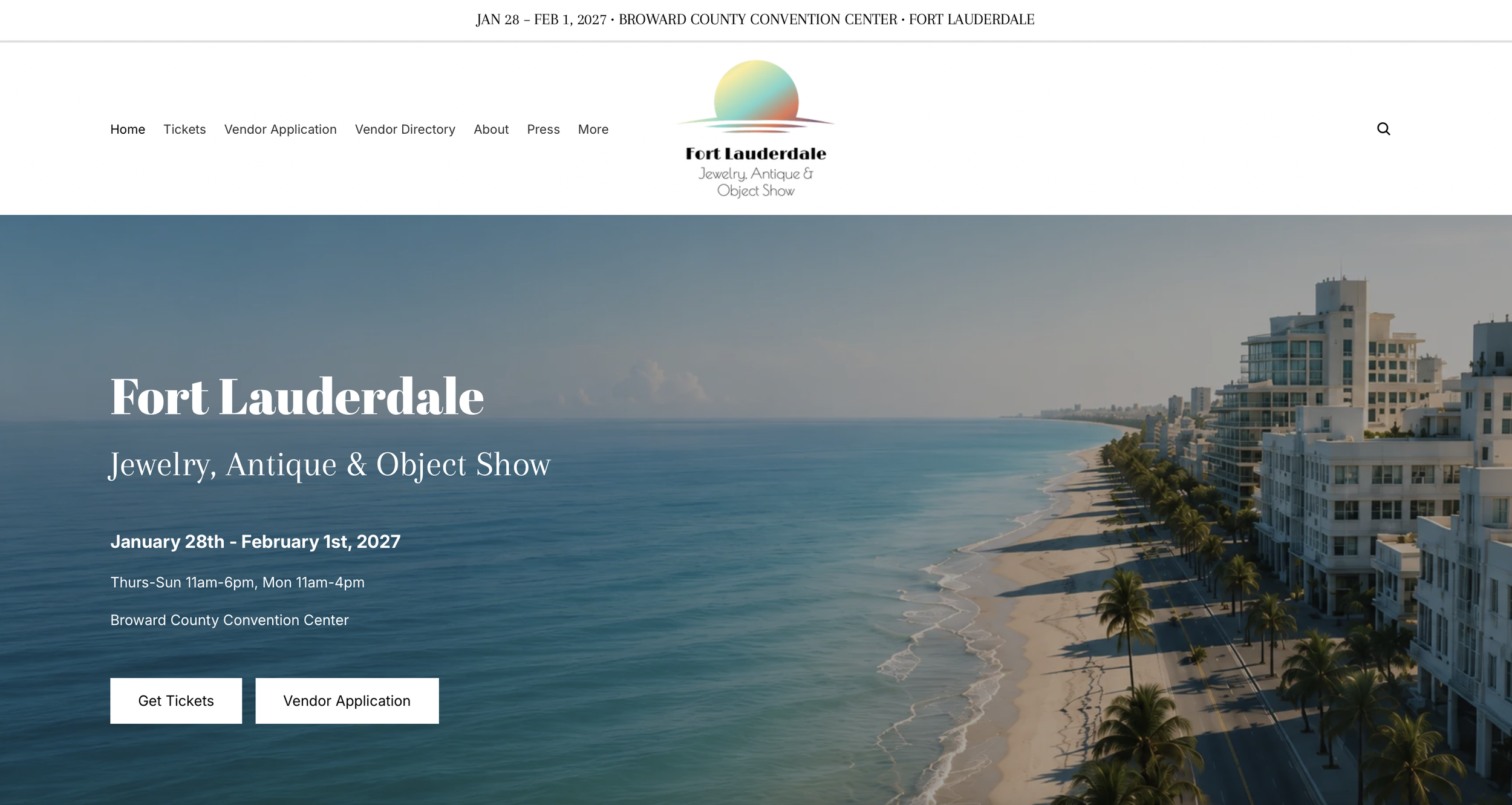
KIL Promotions was launching a brand-new show in Fort Lauderdale, its first event in that market, and needed a site built from scratch under a tight launch deadline. The client's core direction was a South Florida pastel art deco aesthetic, which created a real design tension: the look needed to feel regional and playful without undercutting the refined, luxury feel expected of a jewelry and antiques show. I led the design and build as part of House of NYC.
Process
Given the fast timeline, I started with a single Figma homepage design to establish that visual direction, then moved directly into building the full site in Shopify. The Figma design established the pastel art deco direction: deco-inspired type, ocean and palm imagery, and a soft arched pattern used sparingly rather than overwhelming the layout
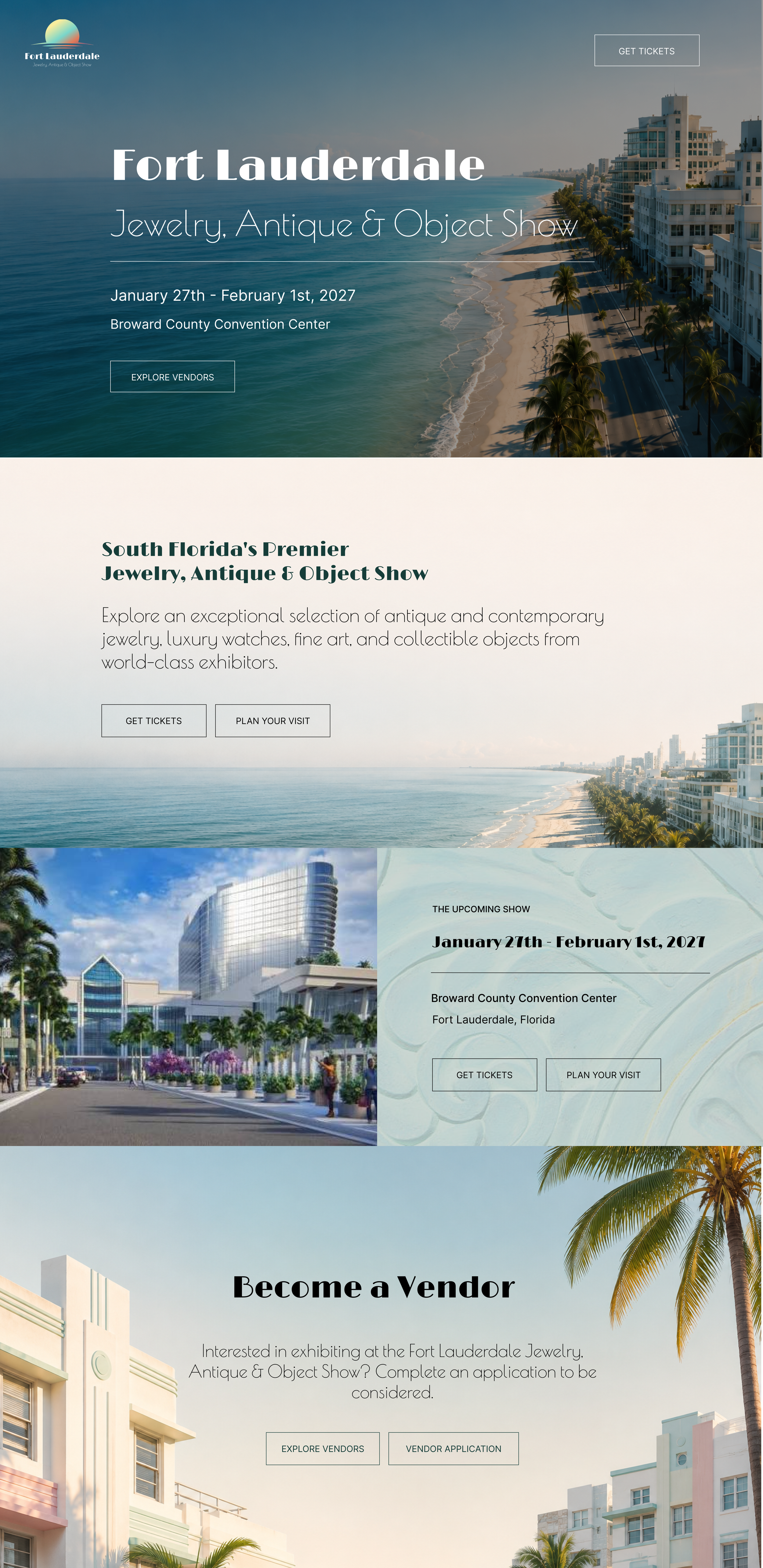
From Design to Build
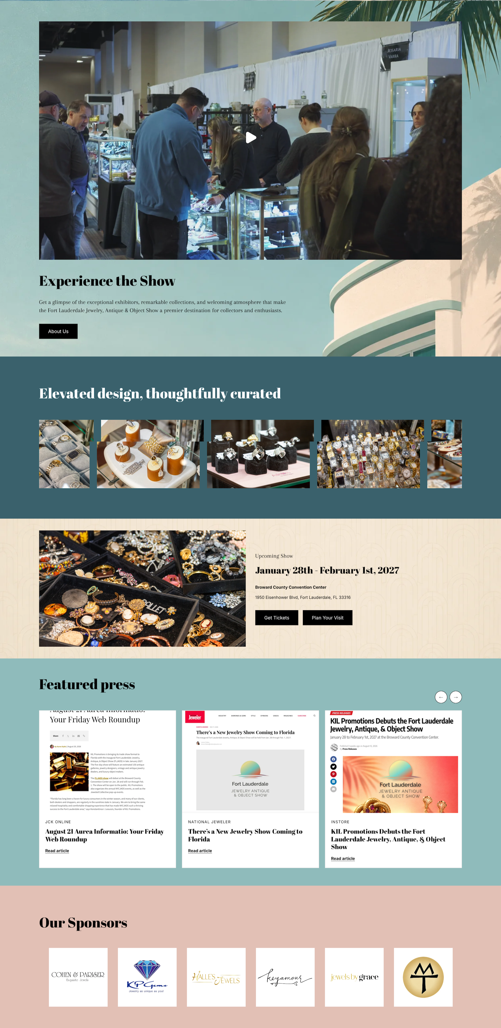
The Figma design established the homepage's visual direction, hero, intro, and the "Upcoming Show" card, but several sections were added during build as real assets became available: a video section ("Experience the Show") using actual event footage, a product photography grid ("Elevated design, thoughtfully curated"), a "Featured Press" section surfacing coverage from JCK Online, National Jeweler, and INSTORE directly on the homepage, and an "Our Sponsors" section. None of this existed in the original Figma, since real photography, video, and press coverage weren't available yet at the design stage. Given the fast timeline, I built these in directly rather than mocking them up first, incorporating real content as it came in.
Key Decisions
Balancing playful regional style with luxury restraint. Art deco cues, arched patterning, deco-inspired type, and a teal-and-cream palette are used as texture and framing rather than letting them dominate. Product photography stays on clean, dark, minimal backgrounds so the objects read as high-value against a beachy, pastel-toned site.
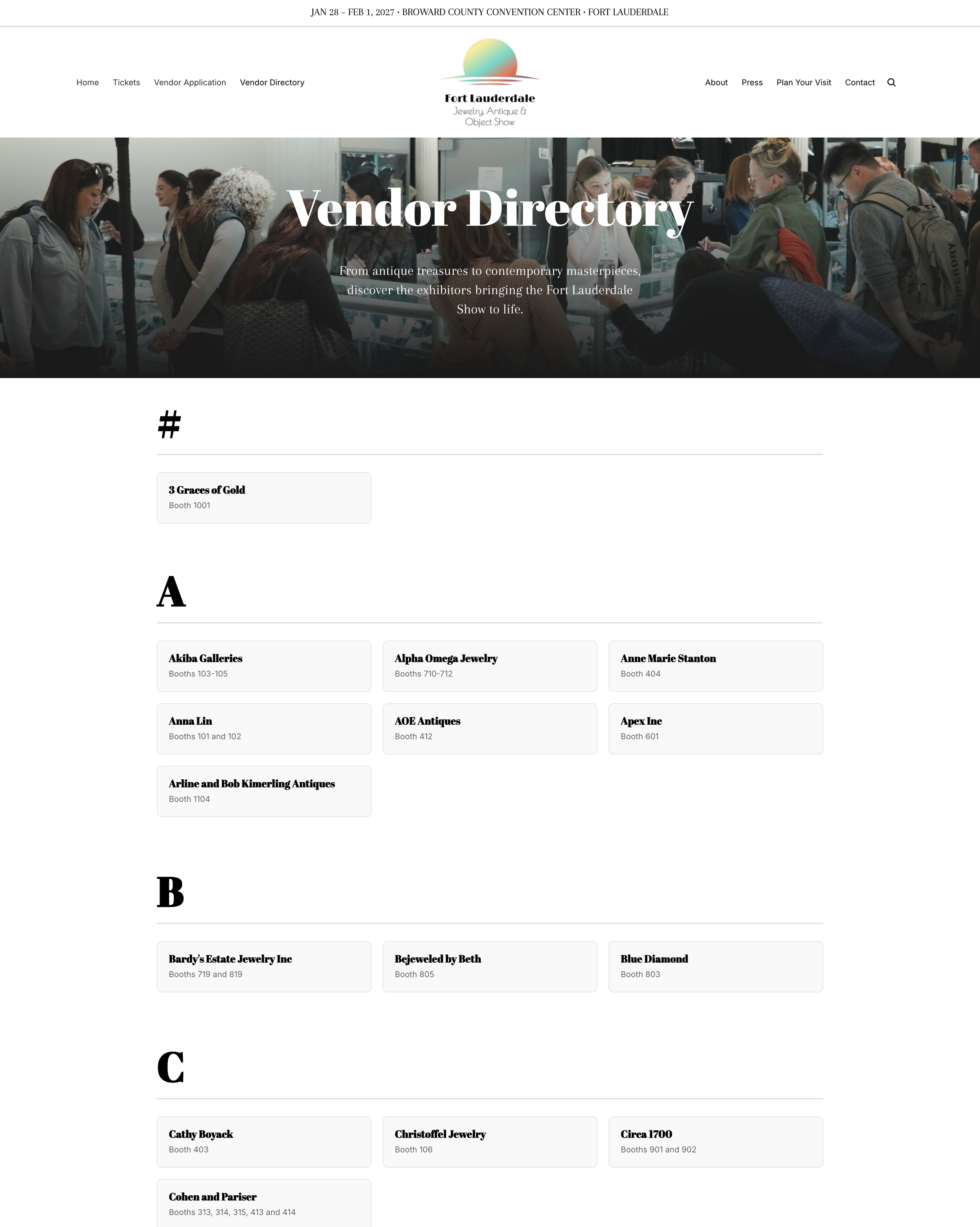
A full site built for a show with no track record yet, not just a homepage. Beyond the homepage, I built out a Vendor Directory, About, Plan Your Visit, and Press pages. Splitting the vendor application from a browsable vendor directory lets a prospective exhibitor see who else is showing before committing, a credibility signal a first-time show badly needs.
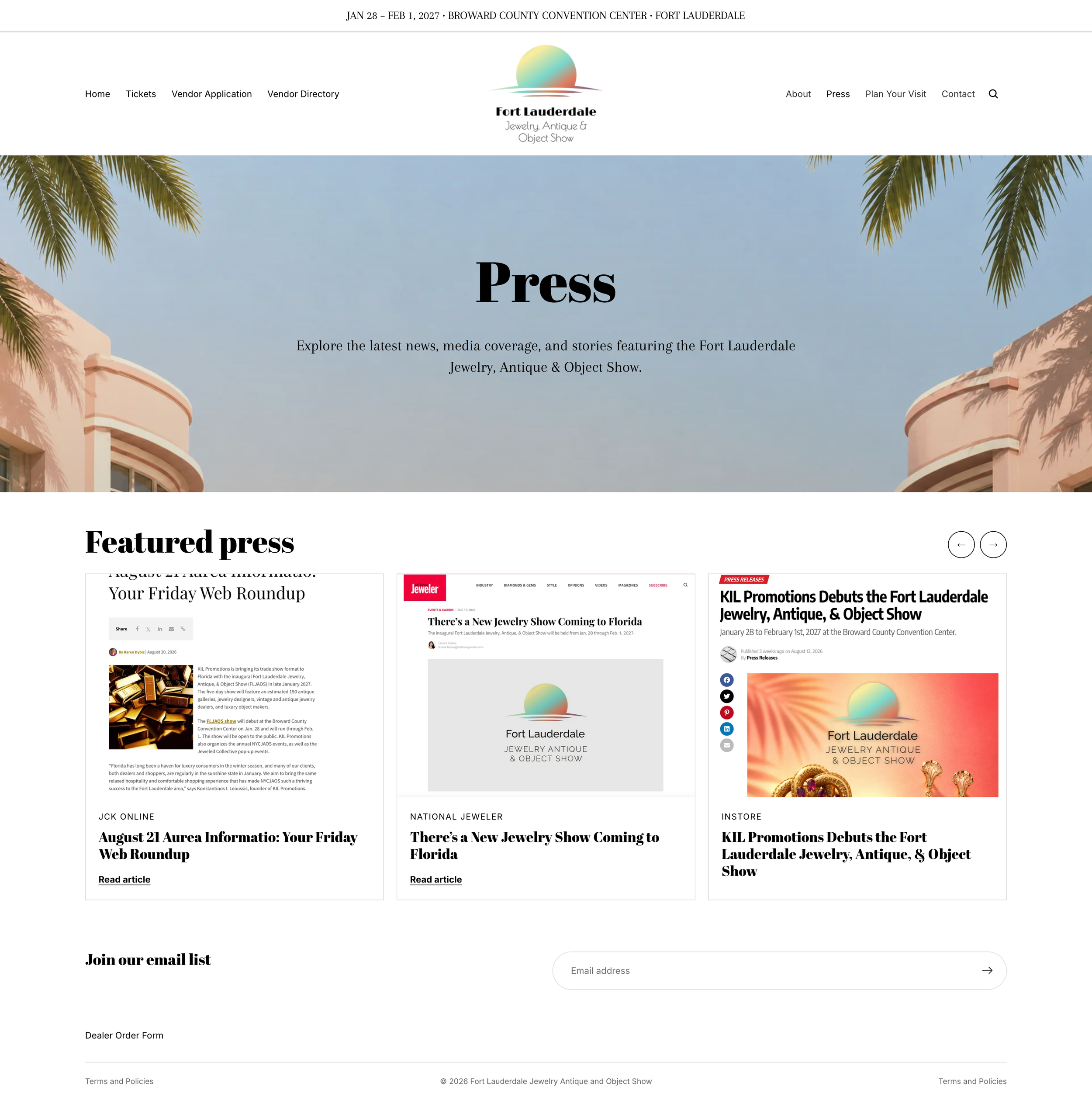
A dedicated Press page as a trust-building tool. With coverage from JCK Online, National Jeweler, and Instore Magazine, this page does the work of borrowing credibility from established industry publications for an event that has none of its own yet.
A Plan Your Visit page separate from Tickets, reducing friction for a first-time visitor unfamiliar with the venue by answering logistics questions before they even get to checkout.
A browsable vendor directory, separate from the application flow, letting prospective exhibitors see who else is showing before committing.
A dedicated Press page consolidating coverage from JCK Online, National Jeweler, and INSTORE, borrowing credibility from established industry publications.
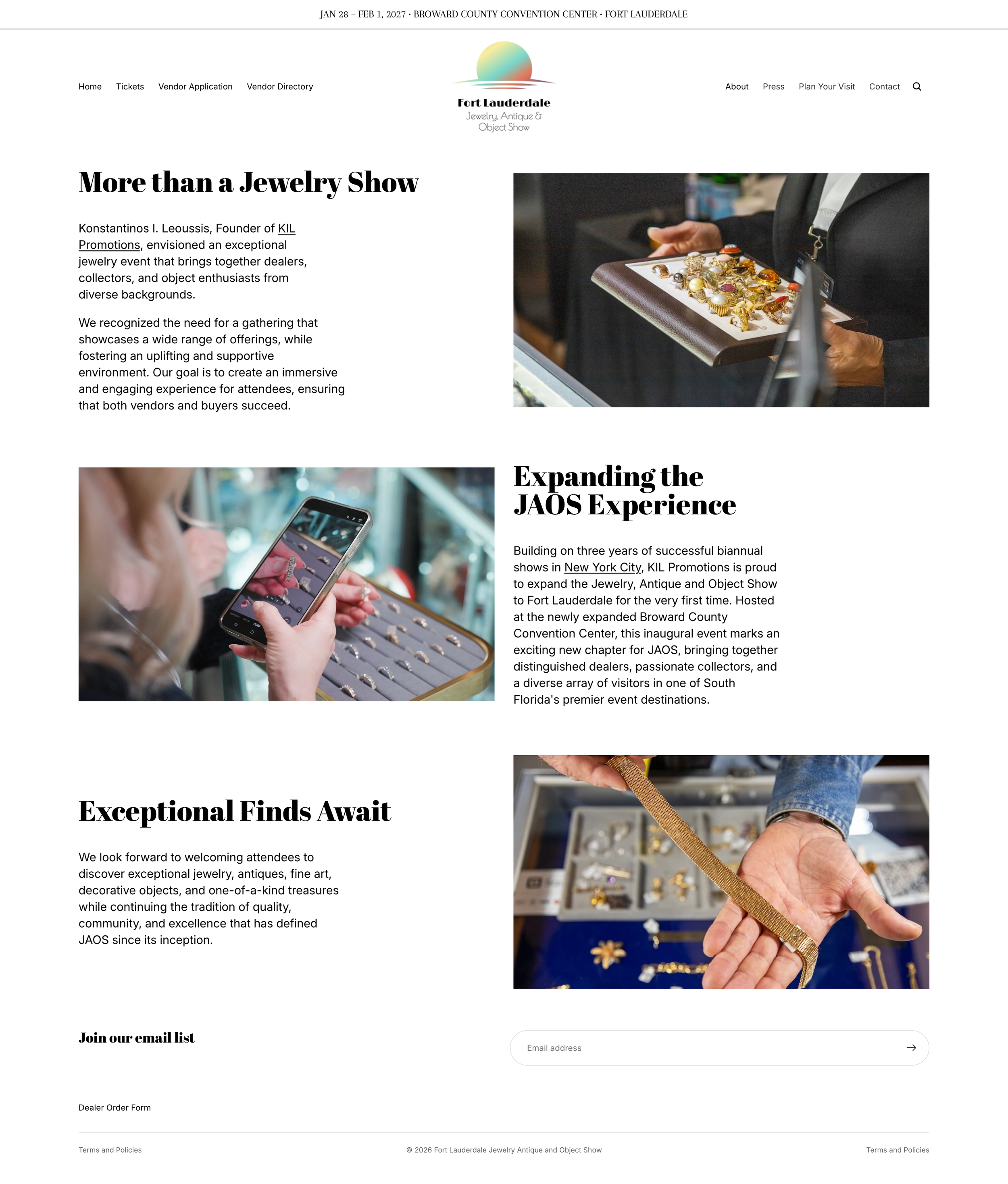
The About page establishes what the show is and who it's for, doing the work a returning brand's reputation would normally handle.
What I'd Do Differently
Given more time, I'd extend the Figma work across the full site before building, rather than establishing direction on the homepage alone and designing the rest during build. I'd also want to test the pastel art deco direction with actual prospective exhibitors before launch.